A Text Scrolling Technique In Perspective
As frequently happens, this tutorial was inspired by a question on the Toon Boom Studio User Forums. The question was "is it possible to do a perspective style scroll similar to the Star Wars opening title sequence using TBS?" So here is a brief tutorial showing one possible technique that will give you that effect. I also included some applications of the TBS Color Transform Effect in animating the text. You can view the final movie first and then come back and read how to create this effect.
The Sample Star Wars Style Perspective Text Scroll
(click on this link to watch the movie)
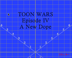
To start, of course we need a new animation project. And the first thing we will need is to create a drawing element for the classic opening text "a long time ago in a galaxy far far away....". Now I need to put my usual reminder in at this point. It is the technique that we are discussing here and the technique is practical and usable by itself. All text and images used in this tutorial are just here to demonstrate this technique. You can use any text and images in your own work and how you name your elements in your own work is your personal preference. You can adopt my naming conventions or not as you so choose.
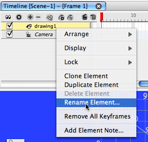
The default drawing element in TBS projects is named "drawing 1", so you could leave it that way. I am going to rename it to "a" because I typically name my drawing elements as alphabet letters. To do this I select the timeline track label for this element and right click to get the context menu. I then select "Rename Element".
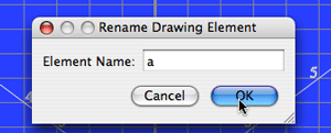
A dialog opens and I can change the name from "drawing 1" to "a" and click the "OK" button.
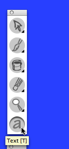
To make the text on my first cell, I select the "text" tool from the drawing tool palette.
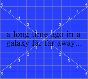
I select a font style and size and just type in the desired text (all personal preferences). I centered this text on my field guide, but in scene planning I'll adjust its size and location as desired using the scene planning operations select tool (6).
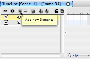
I want to have a "fade in and fade out" for this opening text in my movie so I will do this using a color transform effect. I will add this element by clicking on the "+" icon at the top of the timeline.
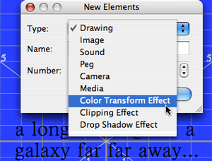
I use the pull-down menu on the element type box to select "Color Transform Effect".
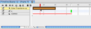
A new track label appears in my timeline track label list and the default 20 frame color transform effect shows in the time line. I am going to select that transform effect and drag it to line up with the first frame of my "a" drawing element which is frame 34 in my example. This is a repositioning of the start of the color transform effect in time. I also named the color transform effect "ca", which is my standard way of naming color transforms to match the element they will control. I will also drag the "a" element track label on top of the "ca" element track label to "attach" the child to its parent.
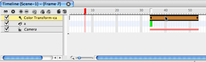
I want this "fade in and fade out" effect to run from frame 34 to frame 120, so I grab the end of the color transform and drag it out to frame 120. I'm not repositioning the effect this time, I'm stretching its duration.
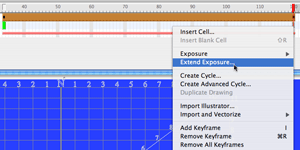
I now select the track for element "a" and move the cursor to frame 120 and right click to get the context menu. I choose "Extend Exposure" to add "hold" exposures for cell a-1 from frame 34 to frame 120.
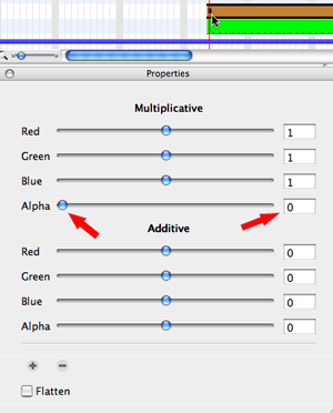
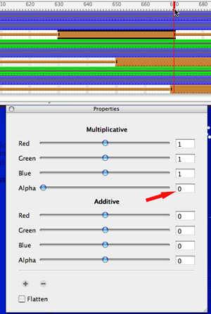
Now I select the "ca" color transform effect and move my frame slider to frame 34. I want to set a key frame here to initialize this transform. I want my text to be "invisible" to start the effect so I set the Multiplicative Alpha value to 0 (zero). This makes the text totally transparent.
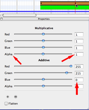
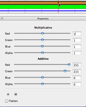
I move the frame slider 25 frames to frame 58 and add a new keyframe to the "ca" color transform. This time I want the text to be totally visible so I set the Multiplicative Alpha value to 1 (one). This make the text totally opaque. I'm also going to do a color change during this "fade in" just to show you how to do that as well. So at frame 58 I also change the Additive values for Red, Green and Blue. My text on cell "a-1" was set to "black" originally which is R=0, G=0, B=0. So I want to get a yellow color by adding 255 to the red value and 215 to the green value. I'm not setting the end RGB value numerically, instead I am creating that end value by adding an offset to the initial RGB value. The color transform effect will gradually animate this color change between frame 34 and frame 58 along with the fade in from transparent to opaque. The transition is linear. I control how long the transition takes by the number of frames between keyframes.
To create the "fade out" part of the effect I move the frame slider to frame 96 and add a keyframe to the "ca" color transform. I don't need to modify any values on this keyframe, I'm just initializing the start of my "fade out". The reason I need this initial keyframe at frame 96 is to control when the transition of the "fade out" begins. I wanted a period of time between the end of the "fade in" and the beginning of the "fade out" where nothing changed regarding this text. (frames 58 to 96 is the equivalent of a constant segment)
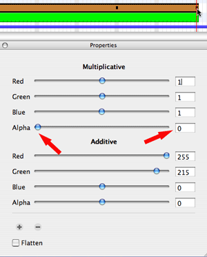
I want to finish my "fade out" at frame 120. So I just need to set the Multiplicative Alpha value for the "ca" color transform effect to zero. To "fade in" I went from transparent to opaque and to "fade out" I'm going from opaque to transparent.
Cell b-1
Now I need to create three new drawing elements for my scrolling text. The number of elements is a function of what I'm trying to accomplish. I basically decided that I would do a separate element for each paragraph of text so that I could individually "fade out" the paragraphs as the text reached "deep space". If all I was doing was just the scrolling without individual "fade outs", I could have just used a single element for the text.
Cell e-1
Cell h-1
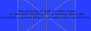
One trick that I employed in creating my paragraphs was to use different font sizes for each paragraph. The top paragraph is 36 pica. The second paragraph is 46 pica and the last paragraph is 48 pica. The idea is that things closer to you in perspective are larger than things farther away, so as the text scrolls away in perspective the relative size of the text in the paragraphs helps the visual effect. I also made sure that each successive line of text was longer that the previous line as well as centered on the previous lime which also enhances the perspective look of the scroll. (kind of like visual vanishing point lines converging)
Before I begin animating the actual scrolling of the text, I added a "space" background. This could easily be just a black matte. I happened to have a library template of a space background that I used in a previous tutorial (Using A Subtractive Animation Technique) so I included it here just to dress up the final movie.
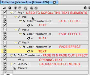
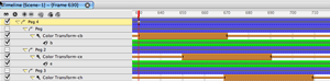
The picture above shows how my final timeline track label list will look. Each text paragraph drawing element is attached to a color transform effect for its individual fade out into "deep space". Each drawing element and its color transform are attached to a parent peg and the three paragraph parent pegs are all attached to a top level peg that will actually control the scrolling of the text. The background is at the bottom of the list along with the opening title drawing element with its attached color transform from the opening "fade in" and "fade out" effect.
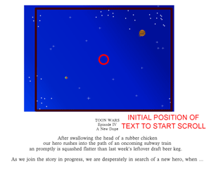
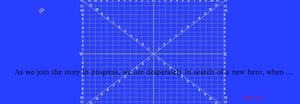
As I mentioned earlier, I will initialize the size and location of the text paragraphs prior to animating the scroll in scene planning view. I use the scene planning operations select tool (6) to do this. You can get a good idea of the relative size of the text with respect to the camera view frame prior to starting the scroll by looking at the picture above.
Click on the image above to see a larger view
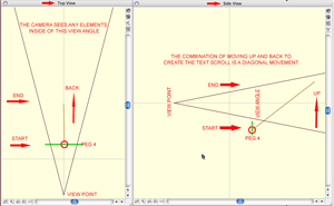
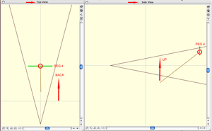
To animate the scroll, I'm going to use the scene planning operations transform tool (7). I collapse the top level parent peg, "Peg 4" in my timeline track label list. When you collapse a peg it not only hides the children elements attached to that peg, it also lets you set keyframes on all elements in a ripple down. A perspective scroll requires the text to scroll up across the screen while it is moving away from the viewer. If you viewed the scroll in terms on 3D space it is a diagonal plane sloping up away from the viewer. We construct this using the top and side view panels. I'm going to be scrolling from frame 126 to frame 720, so I will stretch the duration of "Peg 4" from frame 126 to frame 720, then I right click to open the context menu and select "Extend children exposure" to make sure that I have exposures for all attached elements for the entire scroll duration. We begin by setting a keyframe on "Peg 4" at frame 126 . This is the initial frame for starting the scroll. The scroll lasts until frame 720 so that's where we will also set a keyframe on "Peg 4". Remember the transform tool (7) is actively selected before I set any of these keyframes. Once I set the keyframe at frame 720, I'm ready to reposition "Peg 4" in the top and side view panels. The frame slider is sitting on frame 720. I start in the side view panel and drag the red circle for "Peg 4" up to the top edge of the side view angle. As I do this I can see the text in camera view move across the screen vertically. Then I go to the top view panel and drag the red circle for "Peg 4" back away from the view point in the view angle. As I do this I can see the text getting smaller in the scene planning camera view panel. I now have a vertical slant visible in my side view panel. It may take you some playing around in these two panels to get the effect that you want. It just takes a bit of practice moving things in the top and side view while watching the camera view to see the results. I just need to set the segment between the keyframes on "Peg 4" at frame 126 and frame 720 to non-constant and I'll also use the function editor panel to set the velocity curve for this non-constant segment to the standard ease-in ease-out curve. See Key Framed Animation to refresh your knowledge of these concepts of segments and function curves.
Click on the picture to see a larger view
Click on the picture to see a larger view
Now that I have my text scroll done, I just need to do the "fade outs" for each text paragraph. I position my color transform effects at the desired starting frames for each paragraph and stretch their durations for the length of the effect as desired (all personal preferences).

The initial setting of a "fade out" is opaque so we set the Multiplicative Alpha value to 1.
The final setting of a "fade out" is transparent so I set the Multiplicative Alpha value to 0 (zero) on the last keyframe of the color transform effect. I have to repeat this process of setting the values of the color transform effects for each of the three text paragraphs in my example.
The Sample Star Wars Style Perspective Text Scroll
(click on this link to watch the movie)
As you can see this effect is probably more complicated to explain than it is to create. So give it a try, I hope you learned a new trick or two.
The Sample Star Wars Style Perspective Text Scroll
(click on this link to watch the movie)
To start, of course we need a new animation project. And the first thing we will need is to create a drawing element for the classic opening text "a long time ago in a galaxy far far away....". Now I need to put my usual reminder in at this point. It is the technique that we are discussing here and the technique is practical and usable by itself. All text and images used in this tutorial are just here to demonstrate this technique. You can use any text and images in your own work and how you name your elements in your own work is your personal preference. You can adopt my naming conventions or not as you so choose.
The default drawing element in TBS projects is named "drawing 1", so you could leave it that way. I am going to rename it to "a" because I typically name my drawing elements as alphabet letters. To do this I select the timeline track label for this element and right click to get the context menu. I then select "Rename Element".
A dialog opens and I can change the name from "drawing 1" to "a" and click the "OK" button.
To make the text on my first cell, I select the "text" tool from the drawing tool palette.
I select a font style and size and just type in the desired text (all personal preferences). I centered this text on my field guide, but in scene planning I'll adjust its size and location as desired using the scene planning operations select tool (6).
I want to have a "fade in and fade out" for this opening text in my movie so I will do this using a color transform effect. I will add this element by clicking on the "+" icon at the top of the timeline.
I use the pull-down menu on the element type box to select "Color Transform Effect".
A new track label appears in my timeline track label list and the default 20 frame color transform effect shows in the time line. I am going to select that transform effect and drag it to line up with the first frame of my "a" drawing element which is frame 34 in my example. This is a repositioning of the start of the color transform effect in time. I also named the color transform effect "ca", which is my standard way of naming color transforms to match the element they will control. I will also drag the "a" element track label on top of the "ca" element track label to "attach" the child to its parent.
I want this "fade in and fade out" effect to run from frame 34 to frame 120, so I grab the end of the color transform and drag it out to frame 120. I'm not repositioning the effect this time, I'm stretching its duration.
I now select the track for element "a" and move the cursor to frame 120 and right click to get the context menu. I choose "Extend Exposure" to add "hold" exposures for cell a-1 from frame 34 to frame 120.
Now I select the "ca" color transform effect and move my frame slider to frame 34. I want to set a key frame here to initialize this transform. I want my text to be "invisible" to start the effect so I set the Multiplicative Alpha value to 0 (zero). This makes the text totally transparent.
I move the frame slider 25 frames to frame 58 and add a new keyframe to the "ca" color transform. This time I want the text to be totally visible so I set the Multiplicative Alpha value to 1 (one). This make the text totally opaque. I'm also going to do a color change during this "fade in" just to show you how to do that as well. So at frame 58 I also change the Additive values for Red, Green and Blue. My text on cell "a-1" was set to "black" originally which is R=0, G=0, B=0. So I want to get a yellow color by adding 255 to the red value and 215 to the green value. I'm not setting the end RGB value numerically, instead I am creating that end value by adding an offset to the initial RGB value. The color transform effect will gradually animate this color change between frame 34 and frame 58 along with the fade in from transparent to opaque. The transition is linear. I control how long the transition takes by the number of frames between keyframes.
To create the "fade out" part of the effect I move the frame slider to frame 96 and add a keyframe to the "ca" color transform. I don't need to modify any values on this keyframe, I'm just initializing the start of my "fade out". The reason I need this initial keyframe at frame 96 is to control when the transition of the "fade out" begins. I wanted a period of time between the end of the "fade in" and the beginning of the "fade out" where nothing changed regarding this text. (frames 58 to 96 is the equivalent of a constant segment)
I want to finish my "fade out" at frame 120. So I just need to set the Multiplicative Alpha value for the "ca" color transform effect to zero. To "fade in" I went from transparent to opaque and to "fade out" I'm going from opaque to transparent.
Cell b-1
Now I need to create three new drawing elements for my scrolling text. The number of elements is a function of what I'm trying to accomplish. I basically decided that I would do a separate element for each paragraph of text so that I could individually "fade out" the paragraphs as the text reached "deep space". If all I was doing was just the scrolling without individual "fade outs", I could have just used a single element for the text.
Cell e-1
Cell h-1
One trick that I employed in creating my paragraphs was to use different font sizes for each paragraph. The top paragraph is 36 pica. The second paragraph is 46 pica and the last paragraph is 48 pica. The idea is that things closer to you in perspective are larger than things farther away, so as the text scrolls away in perspective the relative size of the text in the paragraphs helps the visual effect. I also made sure that each successive line of text was longer that the previous line as well as centered on the previous lime which also enhances the perspective look of the scroll. (kind of like visual vanishing point lines converging)
Before I begin animating the actual scrolling of the text, I added a "space" background. This could easily be just a black matte. I happened to have a library template of a space background that I used in a previous tutorial (Using A Subtractive Animation Technique) so I included it here just to dress up the final movie.
The picture above shows how my final timeline track label list will look. Each text paragraph drawing element is attached to a color transform effect for its individual fade out into "deep space". Each drawing element and its color transform are attached to a parent peg and the three paragraph parent pegs are all attached to a top level peg that will actually control the scrolling of the text. The background is at the bottom of the list along with the opening title drawing element with its attached color transform from the opening "fade in" and "fade out" effect.
As I mentioned earlier, I will initialize the size and location of the text paragraphs prior to animating the scroll in scene planning view. I use the scene planning operations select tool (6) to do this. You can get a good idea of the relative size of the text with respect to the camera view frame prior to starting the scroll by looking at the picture above.

Click on the image above to see a larger view
To animate the scroll, I'm going to use the scene planning operations transform tool (7). I collapse the top level parent peg, "Peg 4" in my timeline track label list. When you collapse a peg it not only hides the children elements attached to that peg, it also lets you set keyframes on all elements in a ripple down. A perspective scroll requires the text to scroll up across the screen while it is moving away from the viewer. If you viewed the scroll in terms on 3D space it is a diagonal plane sloping up away from the viewer. We construct this using the top and side view panels. I'm going to be scrolling from frame 126 to frame 720, so I will stretch the duration of "Peg 4" from frame 126 to frame 720, then I right click to open the context menu and select "Extend children exposure" to make sure that I have exposures for all attached elements for the entire scroll duration. We begin by setting a keyframe on "Peg 4" at frame 126 . This is the initial frame for starting the scroll. The scroll lasts until frame 720 so that's where we will also set a keyframe on "Peg 4". Remember the transform tool (7) is actively selected before I set any of these keyframes. Once I set the keyframe at frame 720, I'm ready to reposition "Peg 4" in the top and side view panels. The frame slider is sitting on frame 720. I start in the side view panel and drag the red circle for "Peg 4" up to the top edge of the side view angle. As I do this I can see the text in camera view move across the screen vertically. Then I go to the top view panel and drag the red circle for "Peg 4" back away from the view point in the view angle. As I do this I can see the text getting smaller in the scene planning camera view panel. I now have a vertical slant visible in my side view panel. It may take you some playing around in these two panels to get the effect that you want. It just takes a bit of practice moving things in the top and side view while watching the camera view to see the results. I just need to set the segment between the keyframes on "Peg 4" at frame 126 and frame 720 to non-constant and I'll also use the function editor panel to set the velocity curve for this non-constant segment to the standard ease-in ease-out curve. See Key Framed Animation to refresh your knowledge of these concepts of segments and function curves.

Click on the picture to see a larger view

Click on the picture to see a larger view
Now that I have my text scroll done, I just need to do the "fade outs" for each text paragraph. I position my color transform effects at the desired starting frames for each paragraph and stretch their durations for the length of the effect as desired (all personal preferences).
The initial setting of a "fade out" is opaque so we set the Multiplicative Alpha value to 1.
The final setting of a "fade out" is transparent so I set the Multiplicative Alpha value to 0 (zero) on the last keyframe of the color transform effect. I have to repeat this process of setting the values of the color transform effects for each of the three text paragraphs in my example.
The Sample Star Wars Style Perspective Text Scroll
(click on this link to watch the movie)
As you can see this effect is probably more complicated to explain than it is to create. So give it a try, I hope you learned a new trick or two.
Labels: Key Framed Animation, Key Framing, Tutorial


7 Comments:
when.... when what?!? We need closure!
Nice tut, it does look more complicated when written out, but this really shows how easy it is to put something together in TBS. Nicely done as usual.
Instead of messing about with colour transforms, why not position four or five rectangular slats one on top of each other, covering the top half of the screen? Colour each slat the same as your sky background, but with a gradually increasing translucency (alpha value) from completely opaque (for the slat at the top of the screen) to about 20% (for the bottom slat at mid screen). If all of these are positioned .01 ahead of your text in z-space, the text will appear to gradually fade and disappear as it moves up because it will be underneath the gradually darkening slats. The slats themselves will be invisible agains the same-coloured background (especially if it's black). Any stars can then be placed on top of everything after. You can also use the perspective tool to make the text slant away, like in Star Wars. Just theoretical, but could work. Enjoy all your posts and helpful advice. Cheers. DanB.
That's an interesting approach. Perhaps one of the most creative parts of animating is the solving of problems of how to create an effect or illusion of an effect. There are many paths that can be taken and they often all lead to the same destination. One of the best ways to learn is to experiment with different approach to solving problems. So thanks for sharing.
Agree. These kinds of online forums seem the best way to exchange info. about TBS. I've learned a lot. Just an amendment to my earlier suggestion: Rather than several slats, might be better to just create one rectangle to cover the top half of the camera view, and paint it with a black colour gradation from 100% alpha value to about 10%, top to bottom respectively. This would be quicker and create a more gradual "fade out". As far as the text is concerned, just type out your text and center it, then break text apart twice and group it all. Then use the perspective tool on the grouped text to create your trapezoid shape. Using the transform tool to keyframe, your first keyframe would be with only the top line of text showing at the bottom of the camera view window, covering the entire width of the screen. Your next keyframe would be with the entire box of text shrunk to maybe one or two inches wide and the whole thing moved to the very top of the camera view window. Simply extend the second keyframe in the timeline window to adjust timing of the scroll. Anyway, this is just my guess, but judging from what I know about TBS principles it should work in theory. Haven't had time to test it myself, but might do so on the weekend. If anyone else tries it and it does/doesn't work, let us know. If not, I'll report back later.
Cheers.
DanB.
Well, I had a bit of time, and tried it out. It works beautifully! I have posted the result here on YouTube. Please check it out.
Cheers,
DanB.
http://www.youtube.com/watch?v=np44t_GQDUw
I went to check the example on the other site and only one thing bugs me...COMIC SAAAAAAAANSSS! Please change that!
Life is full of disappointments, try to get use to them. :)
Hopefully the article was informative even if the font wasn't your favorite.
Post a Comment
<< Home