A Good Place To Start - Part 2
Be sure to read Part 1 before you read this next part of our tutorial.
We previously set up a drawing element in TBS, renamed it, and then drew seven "key" poses to make a "stick figure" throwing action. That was animating on 2's and for most actions that would be a good choice. But throwing is a very "fast" action so we might be better served to animate it on 1's. This is an artistic choice not a rule. It is usually easier to animate on 2's or 3's and then to go back and make in between drawings if you feel you need them. We learned in Part 1 to use arcs to describe motion and we used the onion skinning to reference our "previous" drawings. We want to remember and use those arcs for our in between drawings too. And onion skinning is really important when doing "inbetweens" because we need to reference both the "previous" and the "next" drawing so the drawing we are making will fall in the correct place in between those two drawings.
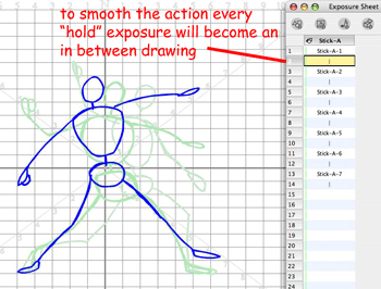
I have a trick I use to change from a held exposure to a new cell for "inbetweening". I use the "cell" tab on the Properties panel. If you highlight the cell you want to replace in the Exposure Sheet and then go to the "cell" tab and move the slider all the way back to your left, you get a blank cell all ready for you to start your next drawing.
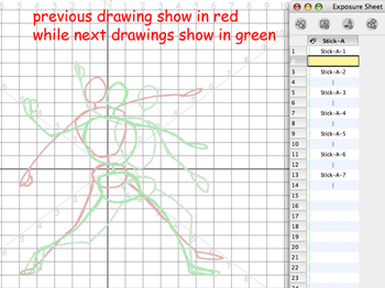
I'm now going to draw my first in between drawing. Because I want to keep this tutorial really simple all of the in between drawings are going to be "spaced" exactly half way between the "key" drawings. If you want to learn more about "spacing" of drawings in animation timing you can read this weblog article.
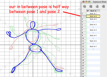
Notice that TBS onion skinning provides us with different colors for "previous" and "next" drawings and we can have as many as three "previous" and three "next" drawings visible. But as a general rule you probably will only want one "previous" and one "next" drawing visible, otherwise it gets confusing. Now this is a great example for learning to "inbetween" because even though you are spacing the in between drawing half way between the keys, the character is twisting and bending so you have to really follow the arcs carefully.
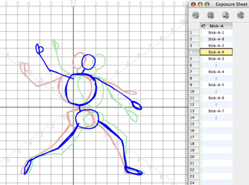
This is also a great example of the shifting of the character's center of gravity and weight as he throws the ball. And you thought I just chose it because it wasn't a "walk" cycle.
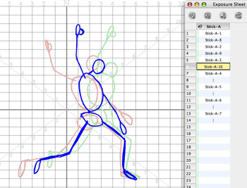
If this is your first animation, you are probably thinking " this is a lot of drawings to make". Animation is fun, but it is a lot more work than drawing a comic book. Not that drawing a comic book isn't a lot of work too. In future articles we will explore ways to reduce the number of drawings and the work, but animation is still time and labor intensive. If you are too lazy to do the work then maybe you should just watch the cartoons and not try to make them.
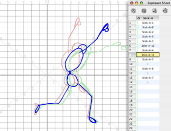
How many in betweens are there in this animation? Answer 7 "keys" on 2's means 6 "inbetweens" to go to 1's and I'll add a 7th drawing to settle out the action too.
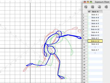
In between drawing may seem like dull stuff, but they have to be placed correctly and you have to study the "previous" and "next" drawings or you can really "kill" the animation.
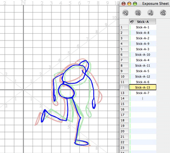
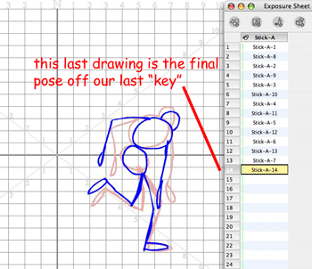
This last drawing is technically not an in between but rather just a final stopping of this action. Some animators refer to it as a "settle" or resting position.
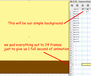
I made a background and added another element to the Exposure Sheet. This is just to make the published animation easy to view on the Internet. And I padded the animation out to a full 24 frames just so it would take 1 second to view before it starts over. This isn't a cartoon, it's a tutorial example.
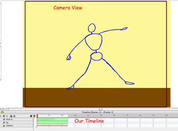
Before you watch this masterpiece, you can switch to Camera View and even look at the Timeline. We didn't spend much discussion about the Timeline in this tutorial because it wasn't important. We will explore the relationship and importance of the Timeline and the Exposure sheet in future articles so "stick" around. (no puns intended)
HERE is the finished animation for you to watch and study. I hope that you picked up some knowledge from this tutorial. Comments and questions are always welcomed. Stick Figures are great as a starting place to learn animation. You don't need to be a great cartoonist or artist to draw stick figures and you can make them do anything and have a lot of fun and learn how to animate even if you aren't 9 years old.
We previously set up a drawing element in TBS, renamed it, and then drew seven "key" poses to make a "stick figure" throwing action. That was animating on 2's and for most actions that would be a good choice. But throwing is a very "fast" action so we might be better served to animate it on 1's. This is an artistic choice not a rule. It is usually easier to animate on 2's or 3's and then to go back and make in between drawings if you feel you need them. We learned in Part 1 to use arcs to describe motion and we used the onion skinning to reference our "previous" drawings. We want to remember and use those arcs for our in between drawings too. And onion skinning is really important when doing "inbetweens" because we need to reference both the "previous" and the "next" drawing so the drawing we are making will fall in the correct place in between those two drawings.

I have a trick I use to change from a held exposure to a new cell for "inbetweening". I use the "cell" tab on the Properties panel. If you highlight the cell you want to replace in the Exposure Sheet and then go to the "cell" tab and move the slider all the way back to your left, you get a blank cell all ready for you to start your next drawing.

I'm now going to draw my first in between drawing. Because I want to keep this tutorial really simple all of the in between drawings are going to be "spaced" exactly half way between the "key" drawings. If you want to learn more about "spacing" of drawings in animation timing you can read this weblog article.

Notice that TBS onion skinning provides us with different colors for "previous" and "next" drawings and we can have as many as three "previous" and three "next" drawings visible. But as a general rule you probably will only want one "previous" and one "next" drawing visible, otherwise it gets confusing. Now this is a great example for learning to "inbetween" because even though you are spacing the in between drawing half way between the keys, the character is twisting and bending so you have to really follow the arcs carefully.

This is also a great example of the shifting of the character's center of gravity and weight as he throws the ball. And you thought I just chose it because it wasn't a "walk" cycle.

If this is your first animation, you are probably thinking " this is a lot of drawings to make". Animation is fun, but it is a lot more work than drawing a comic book. Not that drawing a comic book isn't a lot of work too. In future articles we will explore ways to reduce the number of drawings and the work, but animation is still time and labor intensive. If you are too lazy to do the work then maybe you should just watch the cartoons and not try to make them.

How many in betweens are there in this animation? Answer 7 "keys" on 2's means 6 "inbetweens" to go to 1's and I'll add a 7th drawing to settle out the action too.

In between drawing may seem like dull stuff, but they have to be placed correctly and you have to study the "previous" and "next" drawings or you can really "kill" the animation.

This last drawing is technically not an in between but rather just a final stopping of this action. Some animators refer to it as a "settle" or resting position.

I made a background and added another element to the Exposure Sheet. This is just to make the published animation easy to view on the Internet. And I padded the animation out to a full 24 frames just so it would take 1 second to view before it starts over. This isn't a cartoon, it's a tutorial example.

Before you watch this masterpiece, you can switch to Camera View and even look at the Timeline. We didn't spend much discussion about the Timeline in this tutorial because it wasn't important. We will explore the relationship and importance of the Timeline and the Exposure sheet in future articles so "stick" around. (no puns intended)

HERE is the finished animation for you to watch and study. I hope that you picked up some knowledge from this tutorial. Comments and questions are always welcomed. Stick Figures are great as a starting place to learn animation. You don't need to be a great cartoonist or artist to draw stick figures and you can make them do anything and have a lot of fun and learn how to animate even if you aren't 9 years old.
Labels: Tutorial


18 Comments:
Nice, simple and very very informative. Thanks JK :)
Thanks for this...very helpful. For a product aimed at children, they sure dropped the ball on the training for TBS. But we're determined to learn it anyway, my kids and I. It's our summer project.
keep 'em coming!
bob at bobnolin dot com
I'm significantly older than 9, but think this worked perfectly for me! Thanks!
I also am significantly older than 9 myself, so I'm thrilled you found this useful. Thanks for the nice comment.
Finally, a tutorial that I can start the kids with.
I think TBS is a great product but its tutorials jump in way too fast and too deep.
Thanks for coming to the rescue.
Jerry
I've put off teaching myself TBS for months. Thank you for your help! I'm now looking forward to learning to toon boom with my kids.
hetty
Thanks! I really like your tutorials. They are better than the ones on TBS's website. Keep them coming.
I'm glad you like the tutorials. I have plans for many more to come and I always appreciate comments and suggestions.
thanks a buttload, these tutorials rock!
I've just had a great time following your tutorial. (significantly older than 9!)
At the end, I wanted to use a .png image for my background layer. At first I thought it would show if it were on the last space to the right, at the bottom, in the exposure sheet, but nooooooo.
So, I copied and pasted the image in every cell. That seems like a good way to get a massive file size to me. Did I do it right?
thanks so much for all your good work!
If I understand what you did correctly, it sounds like you imported the background into a single cell for a single frame of your animation. In order for a background to be visible for a length of time in your animation you must have it exposed in multiple frames in a sequence covering the desired screen time. To do this you place the background in the first cell/frame position of the sequence in your exposure sheet and then using the extend exposure command you extend its exposure for the additional frames of your sequence. Extending an exposure is how you tell Toon Boom to "hold" and image on the screen for multiple frames of the movie.
This really helped me figure out where to start in learning how to work Toon Boom. Thanks!
Ah, Extending the Exposure.
That's what I need to do instead of actually having the exposure pasted into every frame. No doubt only having the image actually inserted once will dramatically reduce the file size.
Thanks!
Hi I was finding it very difficult to get started with TBS, and this post of yours is awesome.
I am glad I found ur post.
Thank you for the tutorial! it's very informative.
I would like to add some variations since I had problems to change the exposed cell coming from the previous part.
In TBS 5 I didn't find what expected in the propertied panel, so I used a different method:
I clicked on the second cell (in terms of exposure) and I have pressed the E key, which cancel the cell, then I have pressed Command or Control R (according to the operative system you work with) to insert an empty cell in between.
There was a change in the panels layout that occurred several TBS versions back, after this tutorial was written, where the panels that were all combined under the title Properties were split apart into individual panels. The Cells panel is now a stand alone panel and the Properties panel is now a stand alone panel too. But, the method of using the Cells panel slider as described in this tutorial is still a valuable way to quickly convert from one cell to another in an element or to replace an existing cell with a clean blank cell for inbetweening.
Thank you very much for these step-by-step tutorials. They are easy for a beginner to follow and when followed, produce what you have done at the end of the tutorial.
I am very new to TBS (ver. 8.1) and animation. Thank you for taking the time.
Much appreciated.
Thank you very much for your tutorials on using TBS for us who are just starting out. It is helpful to follow through on a tutorial and then produce similar results to the ones you have.
I like the fact that you give instructions that are clear and easy to follow, along with the background on why things are done.
Much appreciated.
Post a Comment
<< Home