It’s Elemental – Part 1
All animation is created by rendering a series of pictures in a sequence and displaying those pictures at a sufficient rate of speed so as to generate the phenomena called “persistence of vision”. One of a cartoon animator’s goals is to optically blend sequential images together to create the visual effect of continuous motion.
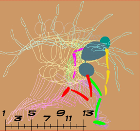
Pictures are composed of multiple picture elements
The individual pictures themselves can consist of a single visual element or a combination of many visual elements. In most animations, the pictures in the sequence, also referred to as the frames in the sequence, are constructed as compositions of many layered picture elements.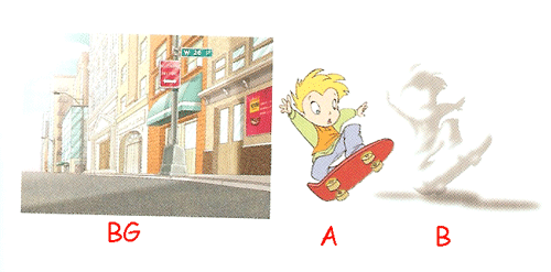
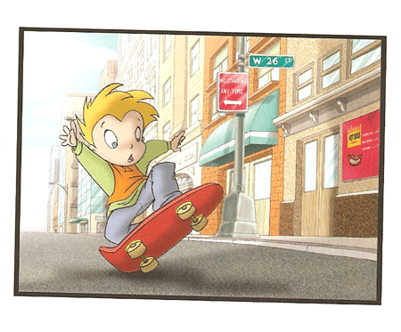
Traditionally, these picture elements are arranged in an overlapping layered stack lying flat under a photographic camera.
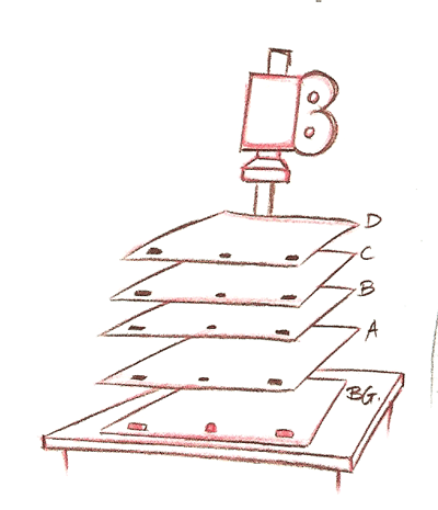
Each picture element traditionally was created individually on a clear transparent plastic sheet called a cell. The stacking order of the cells creates the visual effect of depth by allowing some picture elements to overlap other picture elements producing perspective in a 2D picture. In order to position each picture element’s cell relative to the other elements of that composite picture, there is the need for some means of element registration. And so each cell was pre-punched with several holes that could be aligned on a registration peg bar.
It is totally logical therefore that 2D software applications like Flash or Toon Boom Studio use the concept of “layers” to compose frames. Layers are just a way of describing a stacking or overlapping order. In Toon Boom layers are called elements. (more about the different kinds of element types later)
Going from the physical world to the virtual world
So as we make the transition from the physical world of hand drawn and photographed animation to the Toon Boom Studio virtual world of computer rendered animation, we need to carry forward virtual versions of many of the same tools that were used to produce photographic animations. In Toon Boom Studio, our picture elements or cells become our drawing elements or image elements, etc. as represented by the columns in the TBS exposure sheet.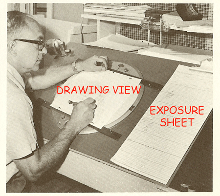
By the way, the TBS exposure sheet itself is a virtual evolution of a similar picture organizational document used in traditional animation. Each element (layer) on the exposure sheet represents a specific level in the composite stacking order of each frame. And the individual picture elements that are contained in each individual exposure sheet element are in fact called cells. So reading across horizontally in the exposure sheet, we can view the stack of cells that makes up a single frame, and their relative positions correspond to their overlapping from the top to the bottom of the composite stack of cells. The top of the stack is to the reader’s far left and the bottom of the stack is to the reader’s far right in the TBS exposure sheet.
Planning layouts with field guides
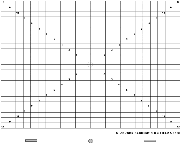
With the TBS exposure sheet, we can describe which cells belong to which elements and we can show how those elements will be ordered in the composite stack for each frame. What about the relative positioning of elements in a frame? One way which evolved from traditional hand drawn animation production for determining relative positioning of picture elements in a frame is a device call a field guide or field grid.
Traditionally this field guide is a transparent sheet printed with a series of concentric rectangles displayed at increments of one-inch in width conforming to the standard 4:3 screen aspect ratio. Also indicated on this grid are the four horizontal plane directional reference points; North, South East and West. The function of the field guide is to provide a standard coordinate system so as to specify the area that the camera will be set up to render. It is also a vital aid to the animator in laying out a scene, working out the final composition of shots and in specifying any camera moves. In TBS the use of a simulated field guide means that if you have your hand drawn art scanned into the computer you will always be able to line up your artwork in Drawing View exactly the same way as you designed it on your drawing board. Essentially in animation, the viewable area under the camera can be expressed in terms of fields of view based on the optical distance from the camera to the art work. The closer the camera is positioned to the art work the smaller its field of view. Of course in the virtual world of TBS, we have no real way to create optical distance, so we can simulate it by scaling the size of our art work. The closer to the camera the larger we scale up our art work and the farther from the camera the smaller we scale down our art work. Scaling is therefore used to create the illusion of optical distance.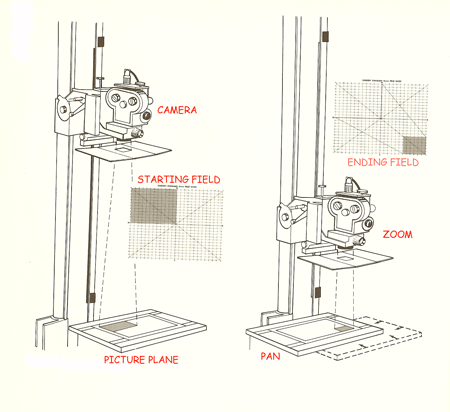
That’s all for this installment, more next time in It's Elemental - Part 2
Labels: Cell Definition, Drawing View, Elements Definition, Exposure Sheet, Field Guide, Fundamentals, Layers Definition


1 Comments:
This is helpful! Since TBS carries forward the traditional terminology, it's nice to know what it means. Now I know why it's called an "exposure sheet."
Post a Comment
<< Home